



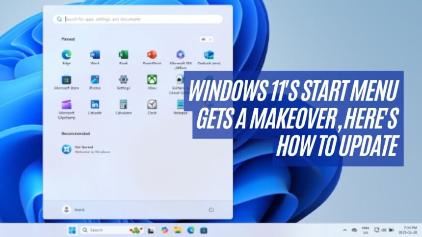
When Windows 11 came out four years ago, the Start menu was shiny but kind of annoying. Now Microsoft is rolling out a fresh design that fixes many of those little problems. Before, you had to click once more to get to “all apps,” and it made people upset. This new layout takes that step away.
I notice the menu now lets me turn off the whole “Recommended” junk that pushed my real apps down. When I right-click inside Start and hit Settings, the personalization tab shows toggles to hide those extra things like recent files or app tips. Once they are gone, I see my full app list right there below the pinned icons.
There’s three different ways to show them too. A simple A-Z list, a big grid that shows everything in one place, and the default groups by category. I prefer the grid myself cause it looks fuller.
Microsoft said the change came because users kept giving feedback, and honestly it shows. If I’m running build 26100.7019 or 26200.7019 and newer, the option should appear. But sometimes it doesn’t, so people use a tool called ViveTool. I tried that trick—download to C:\vive, run command prompt as admin, type `vivetool /enable /id:48319518`, restart—and boom, the new menu showed up.
A blogger even said it worked great for her, which matches my own test. It feels like the company finally heard what folks wanted. The Start menu now puts my apps first, instead of trying to recommend things I didn’t ask for.
Microsoft keeps tweaking Windows 11 every year since 2021, and this change is one more example of listening to people. The original Start menu was pretty, but hiding apps behind extra clicks made no sense. Now with the update, it’s quicker, cleaner, and way more usable. Honestly, it’s about time.
I also think this update shows Microsoft is learning from mistakes. In the past they often added fancy looks but forgot about daily use. With this Start menu change, they are showing that function matters just as much as style. Lots of us just want to open apps without hunting. That’s all. It’s simple but it makes the system feel smoother.
Some people might not care about menus, but for me it’s the first thing I see every day when I turn the PC on. If it gets in the way, it slows down work, and that makes me frustrated. Now with these new options, I feel like I’m more in control. Small details like this add up over time, and it makes the whole system feel friendlier.
Another thing I notice is how flexible the new setup is compared to older versions. In Windows 10 the Start menu was stuffed with live tiles, and in early Windows 11 it hid apps under layers. This update feels like a mix of both worlds but less messy. The fact that I can switch between list, grid, or categories means everyone can pick the style that fits them best. I like having choices, cause not everyone uses their computer the same way.
It also makes me think about how updates shape the way people feel about their devices. One small change like removing a recommended box may look tiny, but it actually changes how often I open apps or how fast I get to work. Microsoft didn’t just redesign looks here, they adjusted the flow of how I use my machine every single day.